01
Brand Identity · Packaging2026
Brand Identity · Packaging
GOLMOKGIL
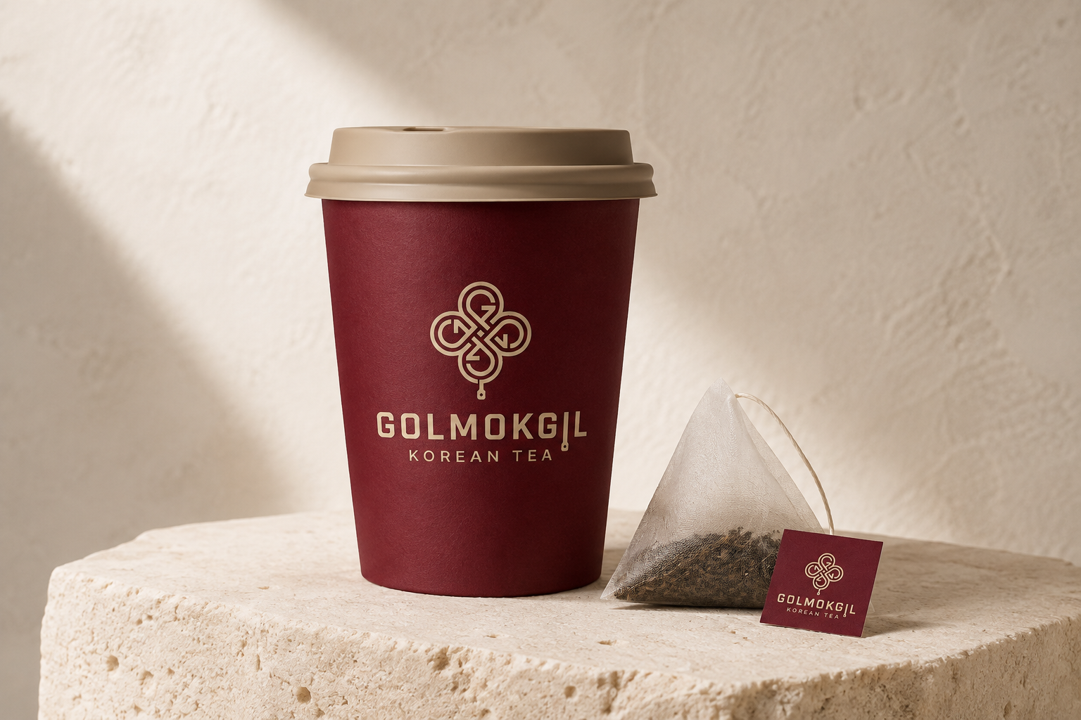
A contemporary take-away tea bar inspired by the narrow alleys of Seochon. The identity connects Korean tea culture with the rhythm of walking through the city.
View case study ↘I build clear, characterful worlds across
brand identity and digital experiences.
Selected work
(04)Brand Identity · Packaging
A contemporary take-away tea bar inspired by the narrow alleys of Seochon. The identity connects Korean tea culture with the rhythm of walking through the city.
View case study ↘
UX/UI · Service Design
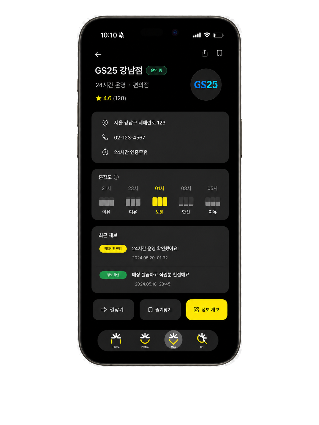
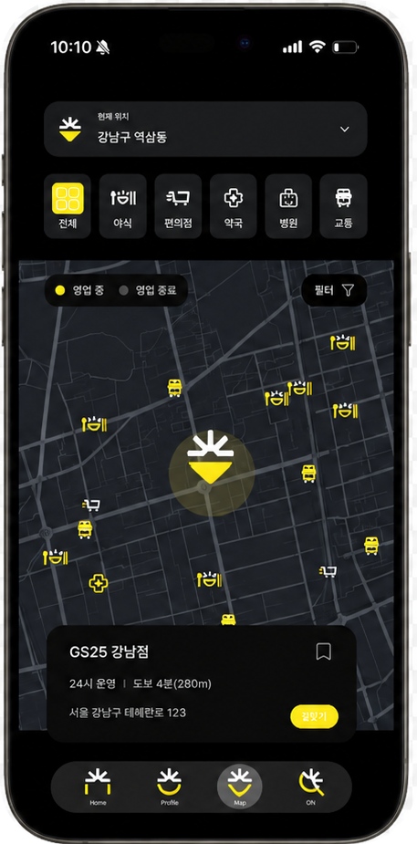
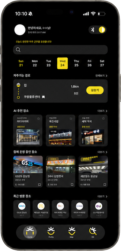
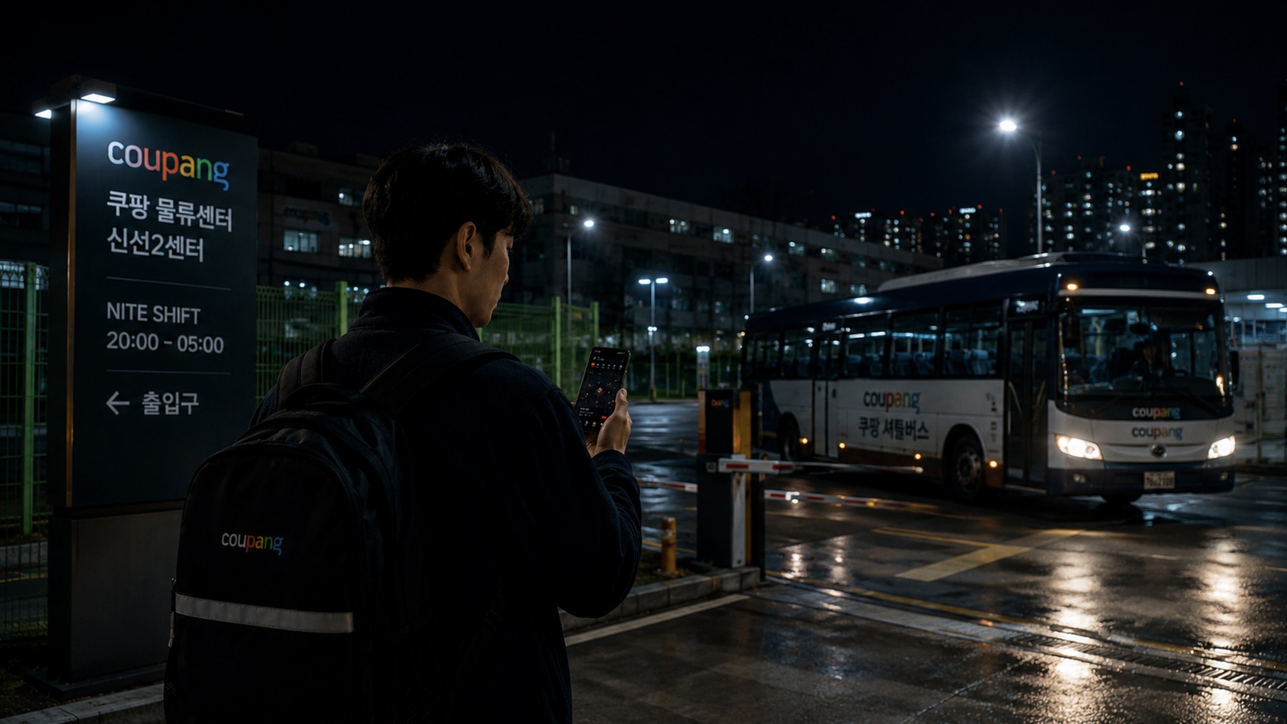
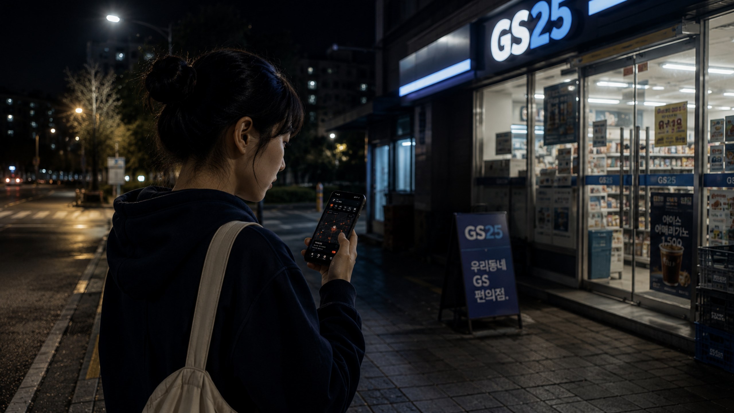
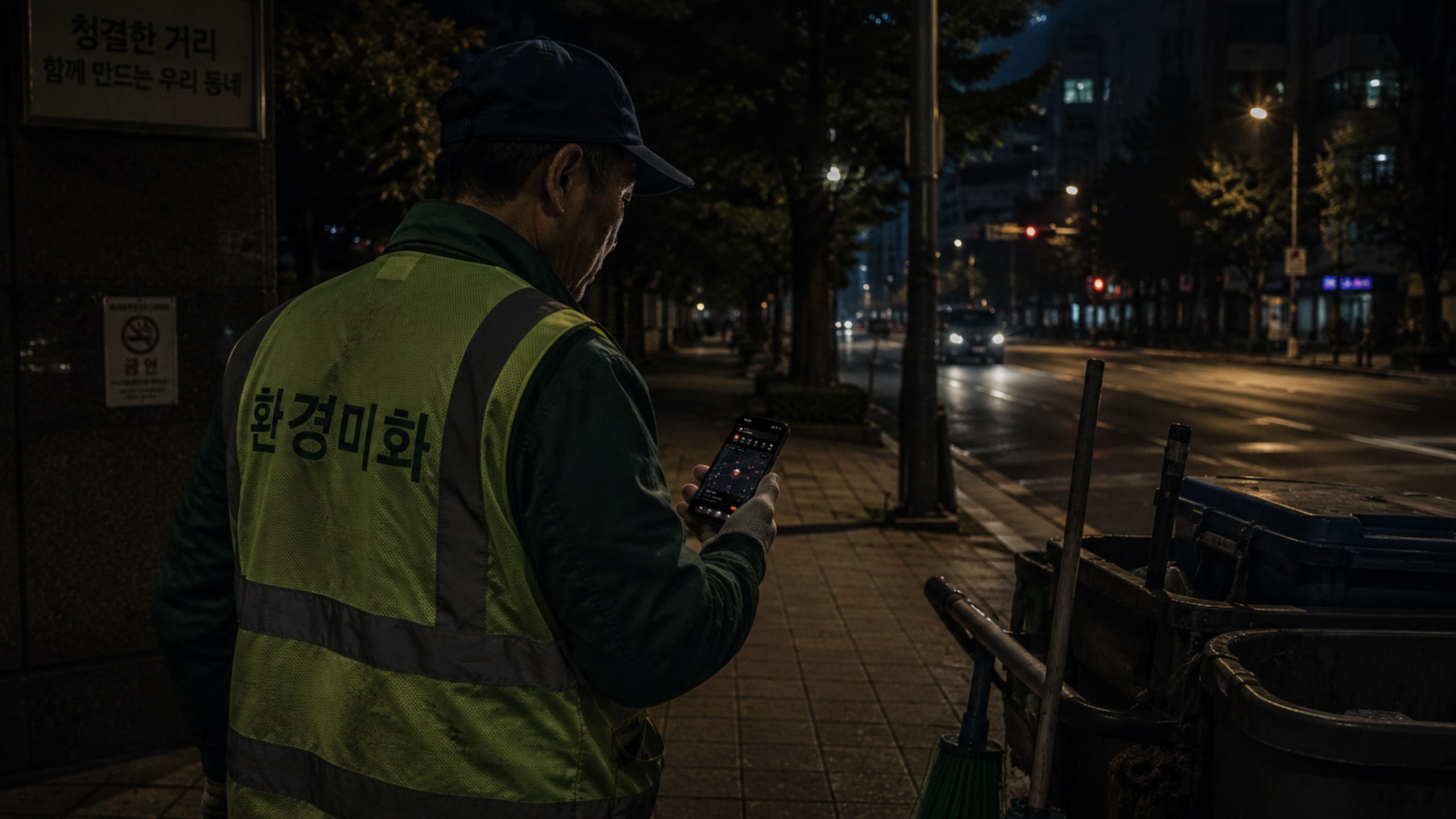
A night-time city platform for people who work after dark—making open services, safer routes and reliable local information easier to find.
View case study ↘Brand System · Digital
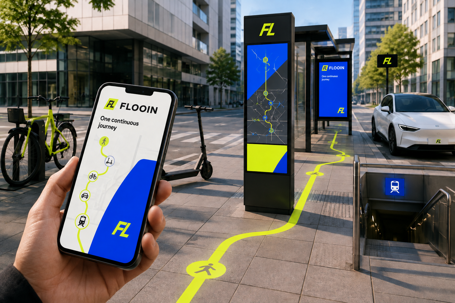
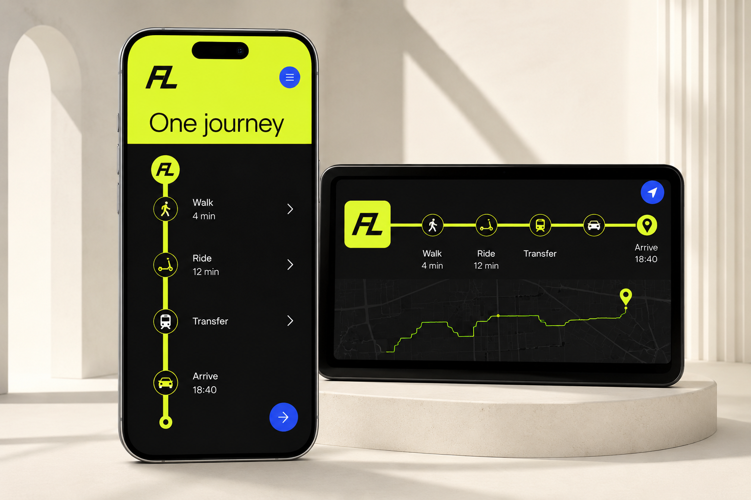
A visual system for fluid connections between global cities. Motion, wayfinding and interface elements form one continuous journey.
View case study ↘
Festival Identity · Campaign
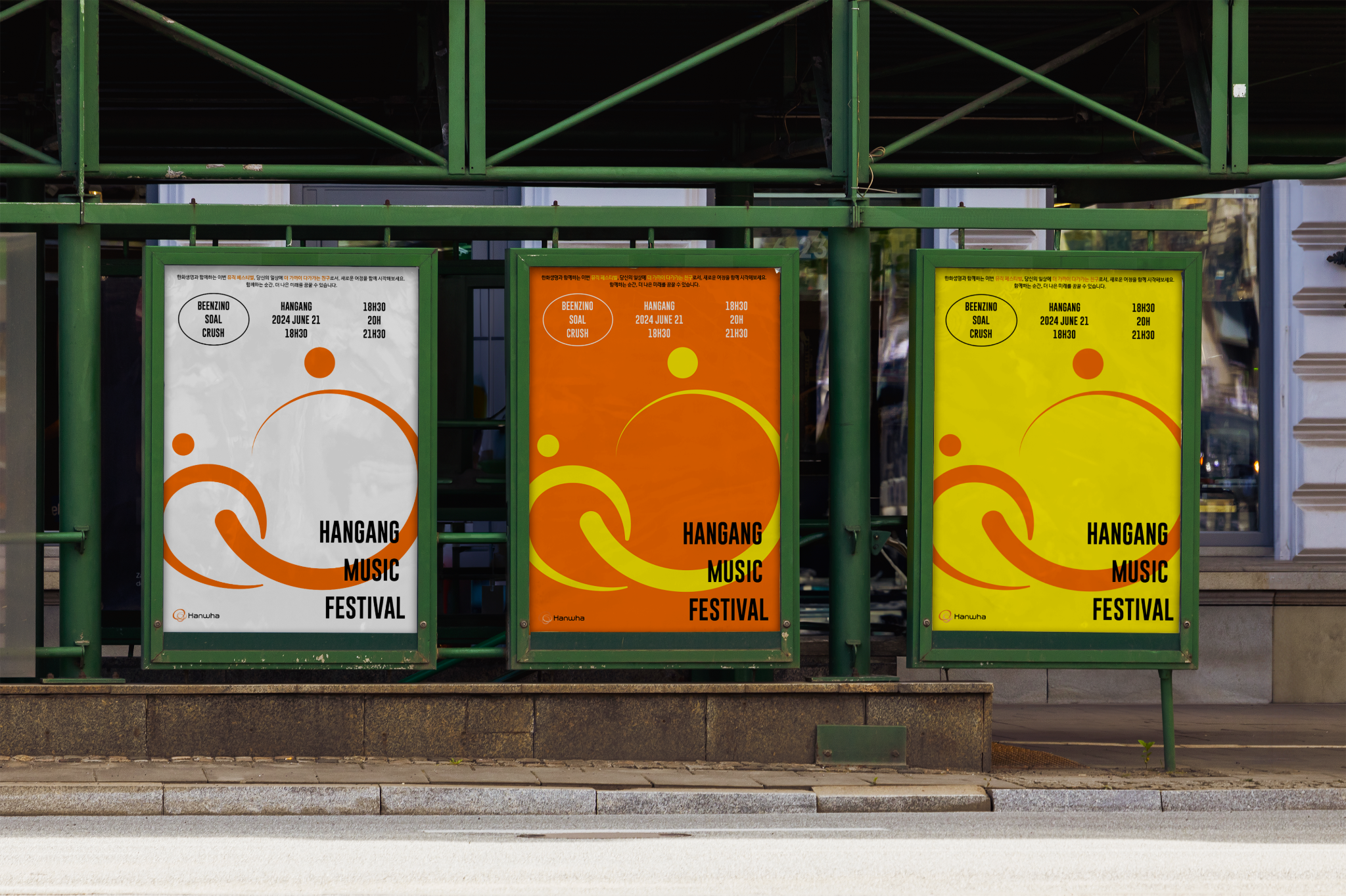
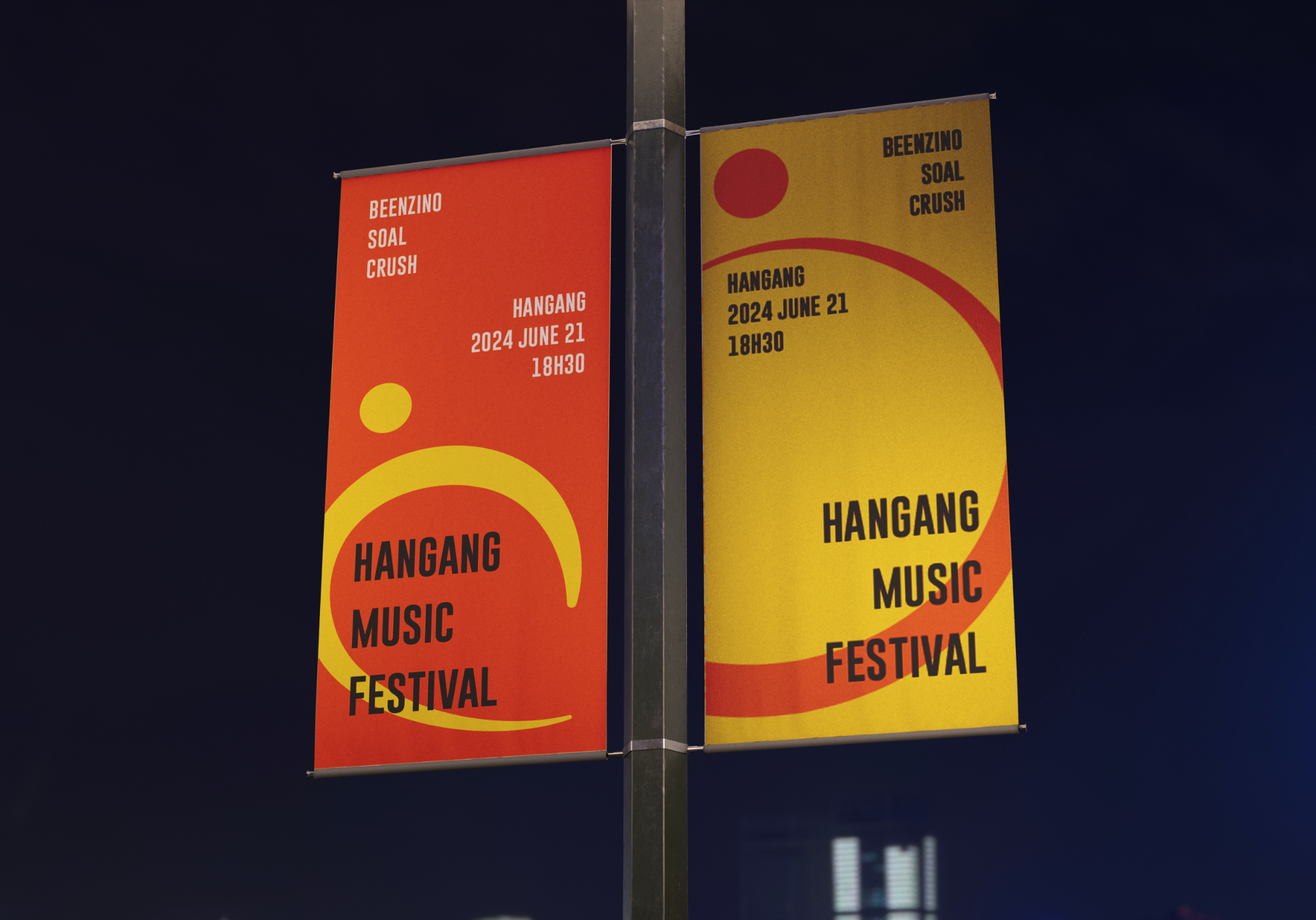
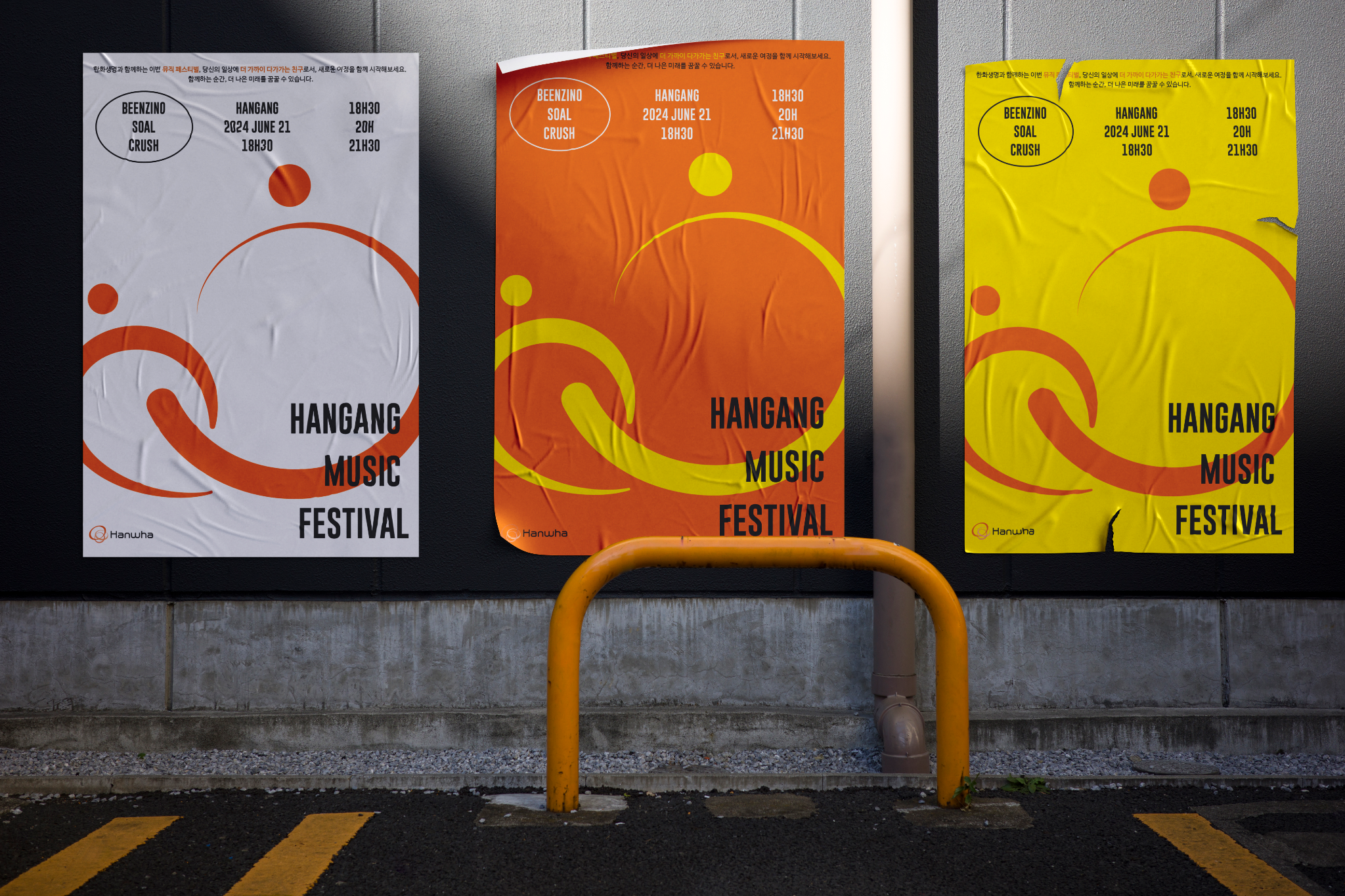
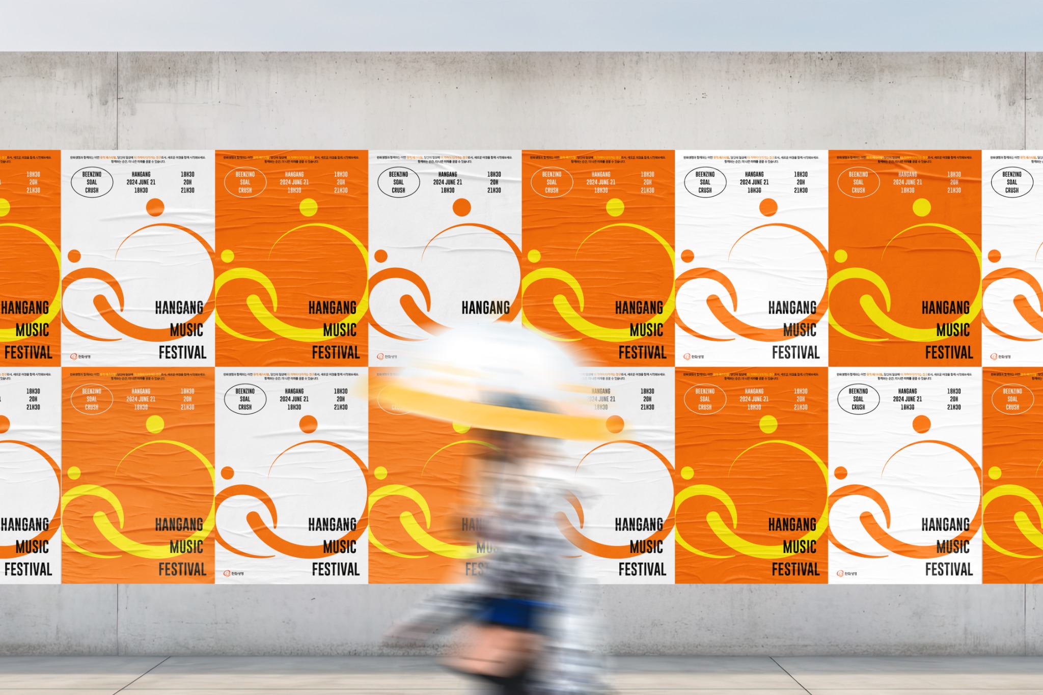
A vibrant festival identity with Hanwha Life, celebrating gratitude, togetherness, love and friendship by the Hangang.
View case study ↘A take-away Korean tea brand that turns a formal, sit-down tradition into an everyday drink made for walking through the city.
TRADITIONAL TEA
TO GO
The idea
GOLMOKGIL shifts Korean tea from a ceremonial destination to a light, mobile ritual. Positioned along cultural walking routes around Gyeongbokgung, Deoksugung, Seochon and Bukchon, the brand connects flavor, place and movement for young locals and international visitors.
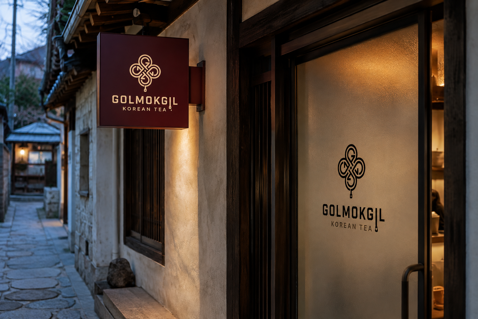
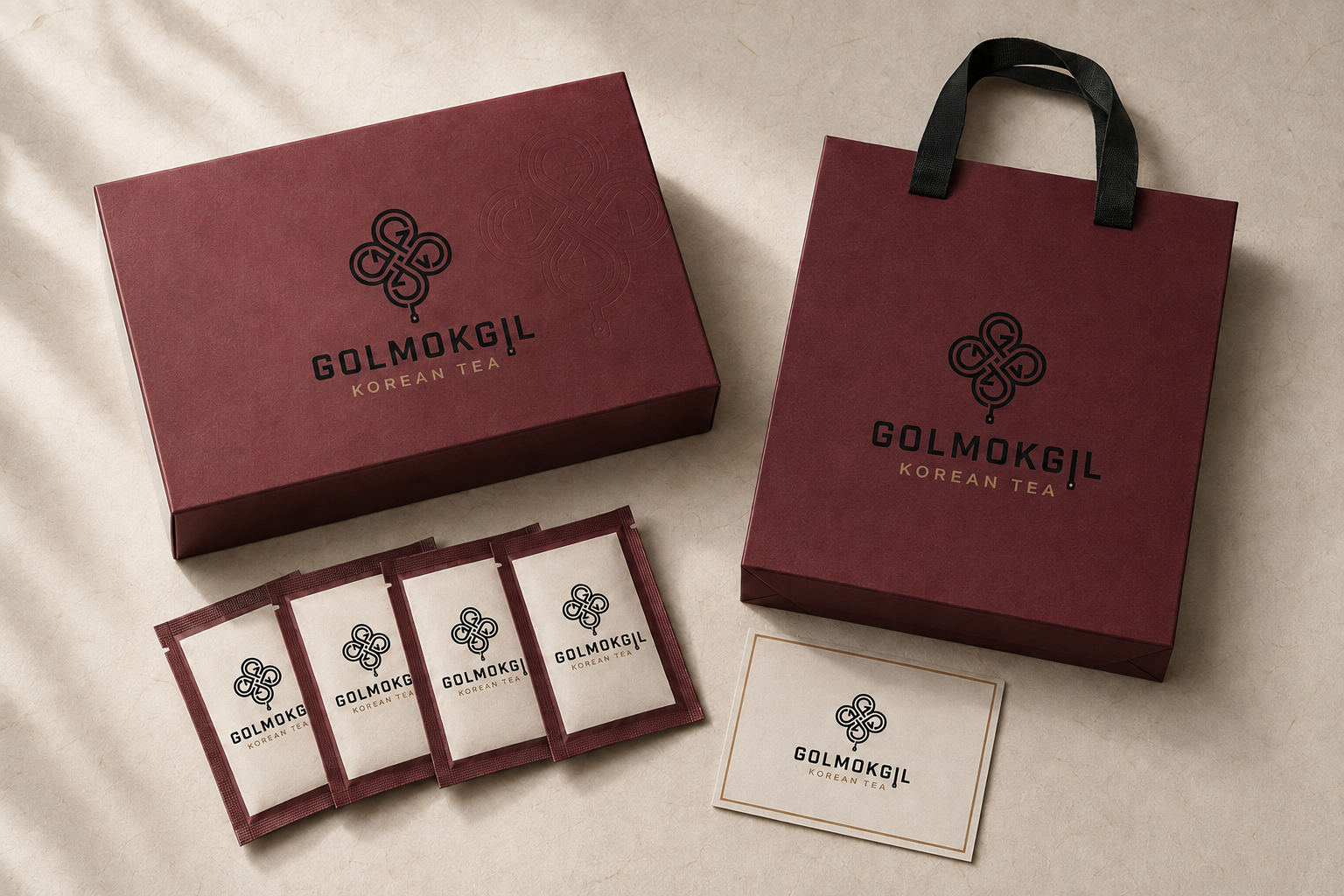
 GOLMOKGIL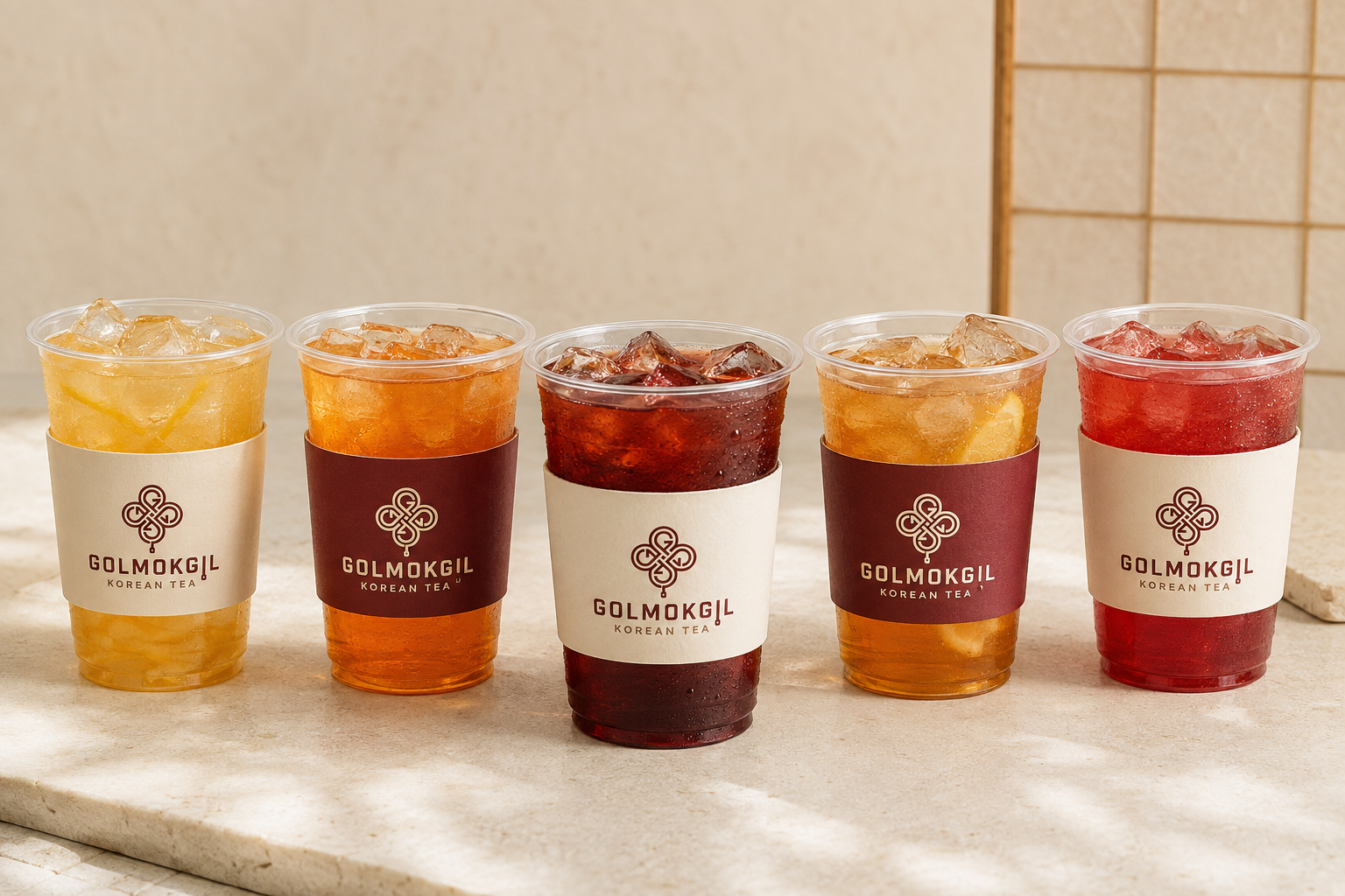
Warm, grounded colors reference traditional ingredients and the materiality of Hanji without becoming nostalgic.
A city service that keeps useful information on when the rest of the city switches off.
A city guide built
for the night shift.
 SEOUL / AFTER DARK / 2026
The challenge
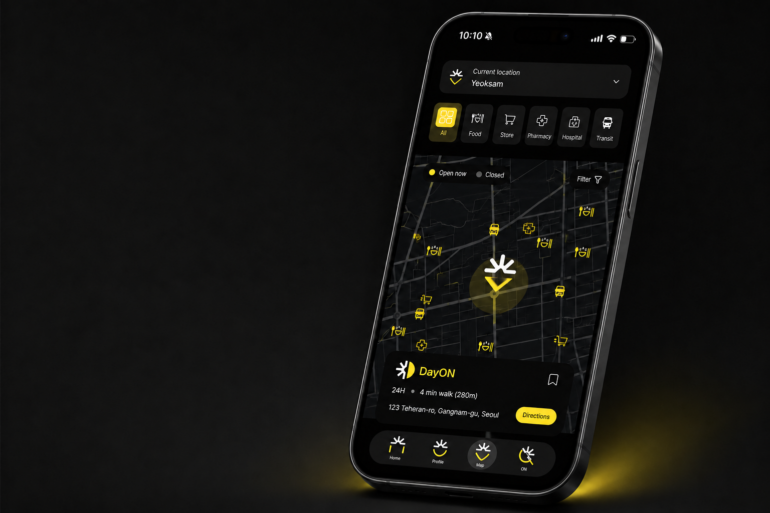
Late-night services are fragmented and often unreliable. DayON brings open places, safer routes and real-time reports into one clear interface.
DayON shifts city search from static place data to time-aware information that responds to what is available now.
A signal that connects daylight energy
with the rhythm of the city at night.
Core experience
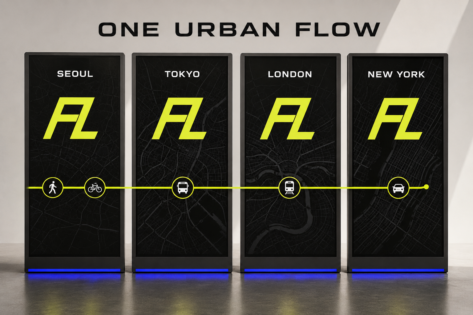
A global mobility experience brand connecting people, places and moments through one seamless journey.

FLOOIN
ONE CONTINUOUS URBAN FLOW
The experience
Flooin does not operate a single mode of transport. It designs the full journey—walking, riding, transferring and arriving—through one calm, connected system.
Physical spaces and digital guidance move together.
A warm, energetic identity for a shared summer music experience with Hanwha Life.
GRATITUDE · TOGETHERNESS
LOVE · FRIENDSHIP
The idea
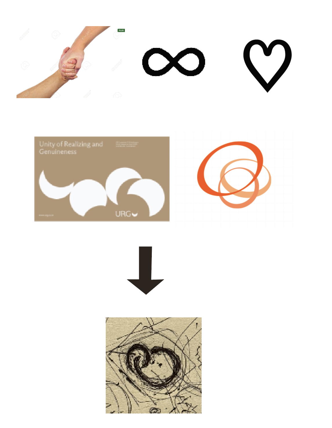
The symbol grows from linked hands, an infinity loop and a heart. Its flowing form becomes a warm visual language for the relationships and emotions that gather by the Hangang.
Logo development
Connection, infinity and the heart are distilled into a single flowing symbol—turning togetherness into an image that feels open, joyful and alive.
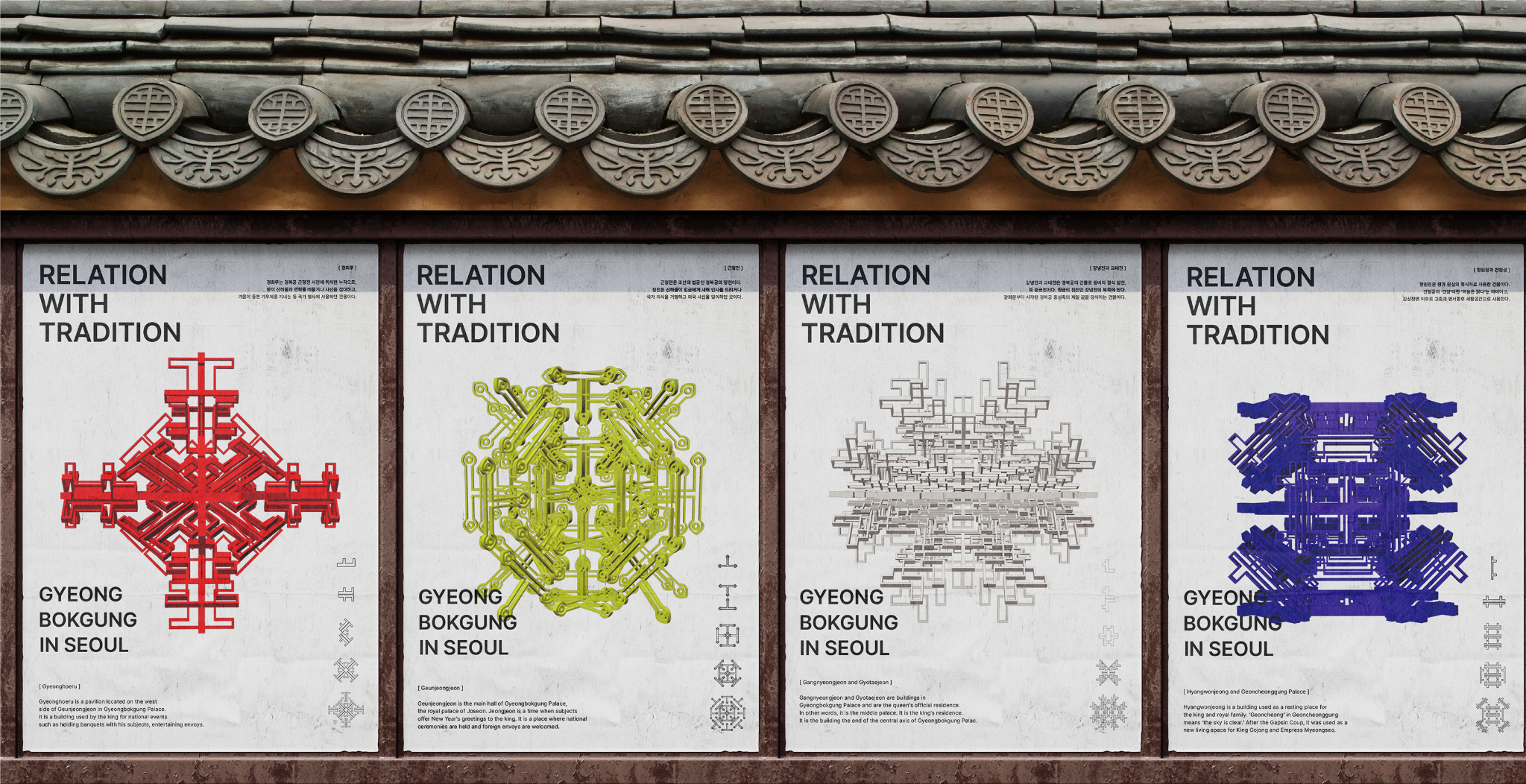
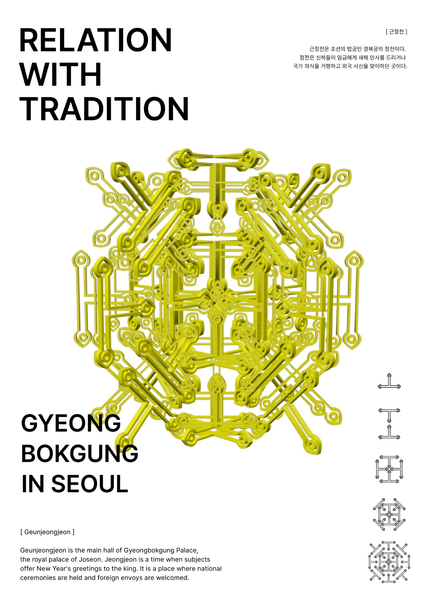
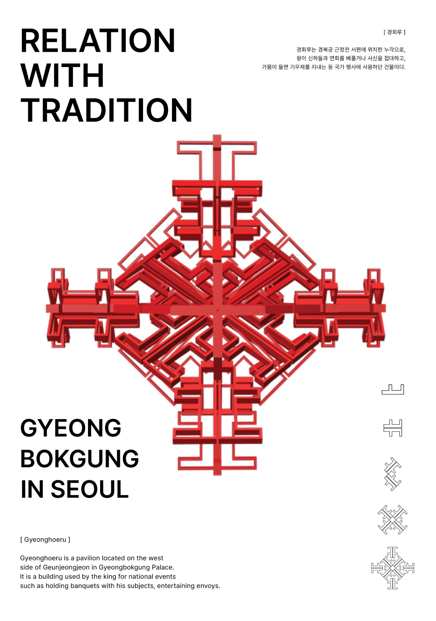
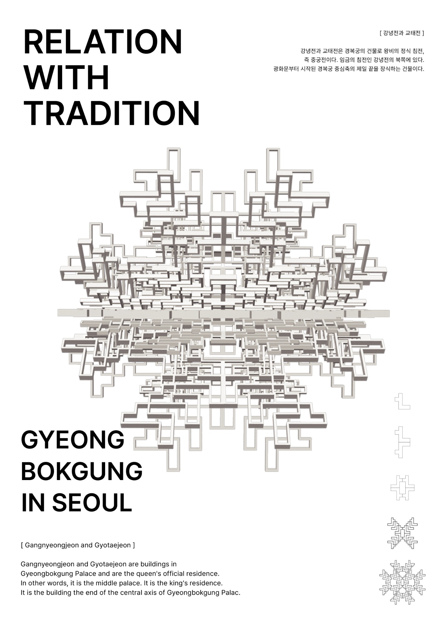
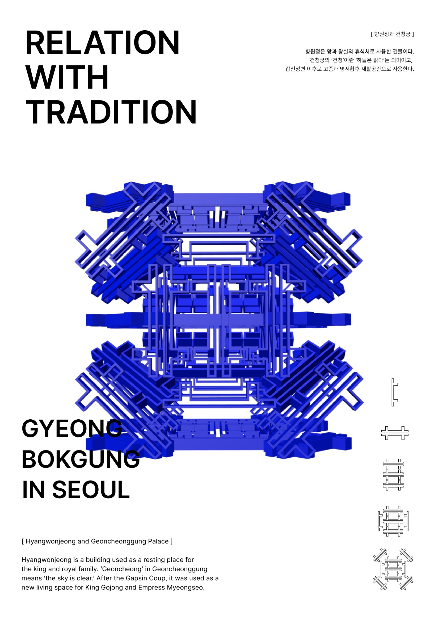
A poster series that reinterprets architectural details from Gyeongbokgung Palace as contemporary modular graphic forms.
The concept
Small structural details from four palace buildings are observed, reduced into simple modules, then repeated and connected into dense three-dimensional forms. The system translates historic architecture into a direct visual language for international visitors.
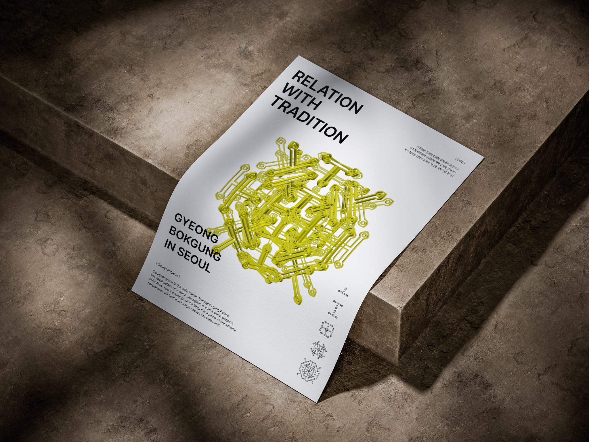
Rendered geometry meets a restrained editorial grid, allowing each architectural form to remain the focus.
The process
Each composition begins with one architectural feature. The module is mirrored, rotated and layered before being extruded in Cinema 4D and refined for the final poster system.
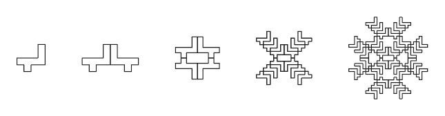
Rectangular column details are mirrored and repeated into a balanced, eye-like structure.
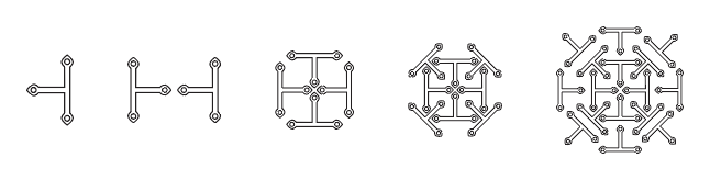
Simple structural forms expand radially to express royal authority, order and strength.
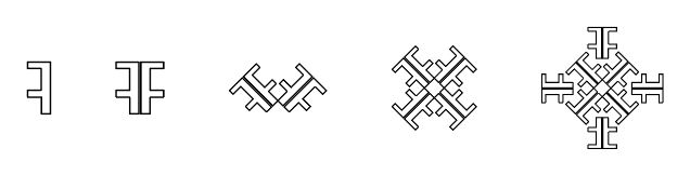
A floral geometry grows through rotation and reflection, referencing royal celebrations and gatherings.
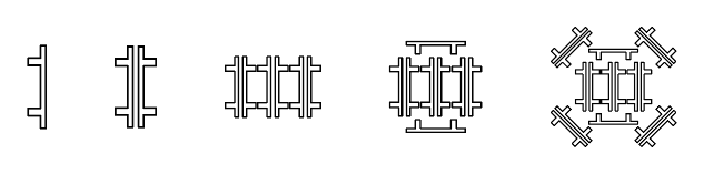
Pavilion lines meet the rhythm of Korea's first electric streetlights in a precise modular frame.
About / Soohyun Lim
I'm a visual designer based in Seoul, focused on branding and UX/UI. I enjoy turning observations about people, place and culture into systems that feel both useful and memorable.
My practice moves between identity, editorial, packaging and interface design—with a particular interest in how a brand behaves beyond a logo.